Mint now on Prohibition.art
On a trip to Memphis, I visited a Brazilian Steakhouse for the first time. I was not prepared for
the parade of meats to come. The steak, lamb, bison, grilled pineapple, pork, and even chicken
hearts were all delicious. The servers do not stop the offerings until you flip your indicator to
show you have had enough. It is hard to say no to the cavalcade of meat swords. It was glorious.
Then comes the moment in life where somehow the good you were caught up in takes a turn for the
worse. I started to sweat. My breath felt labored and my stomach was angry. It almost felt like I
was hallucinating. And that was the time that I got The Meat Sweats In Memphis.
When Good Things Take a Turn For the Worse
Watch Overview Video
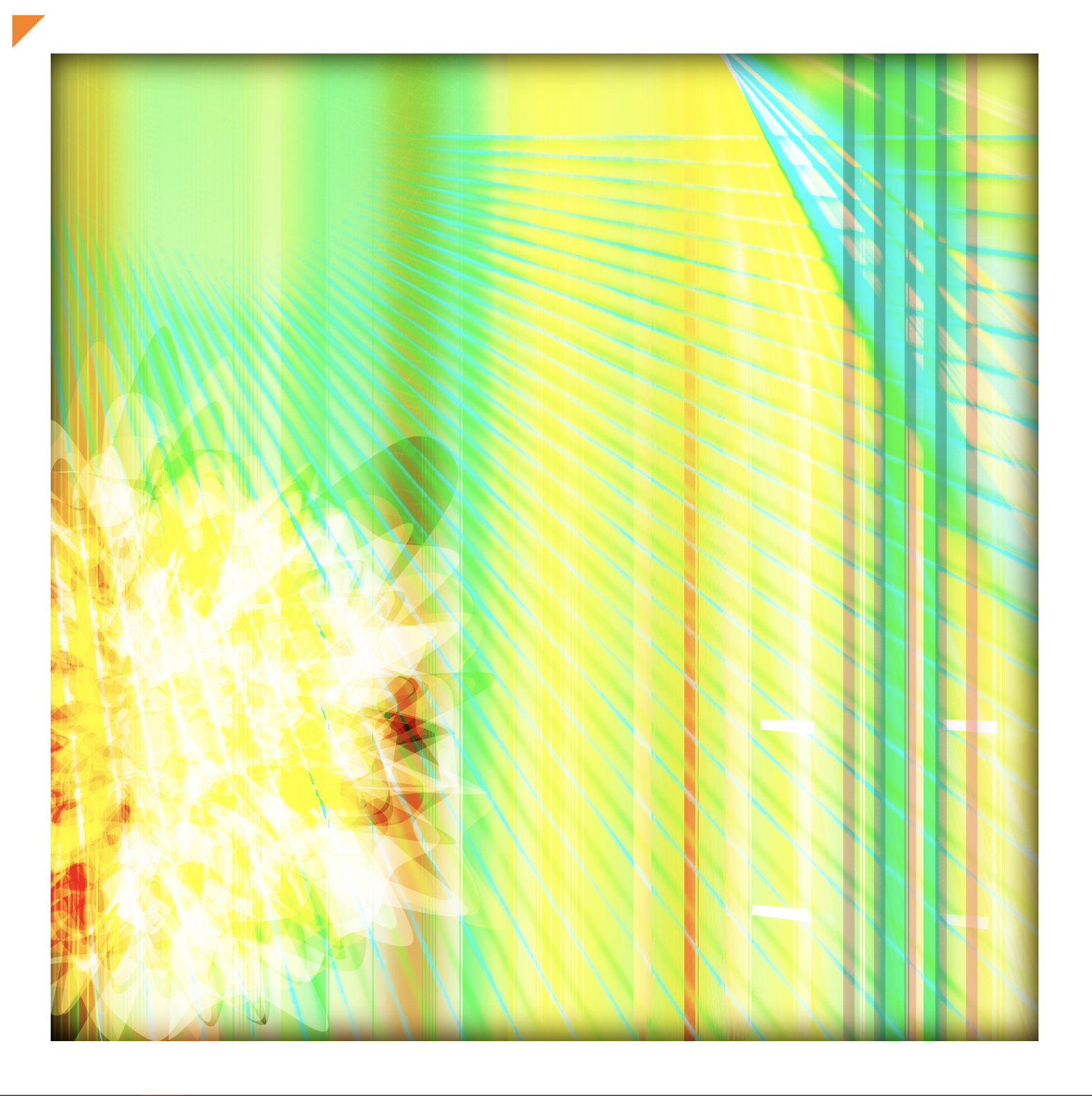
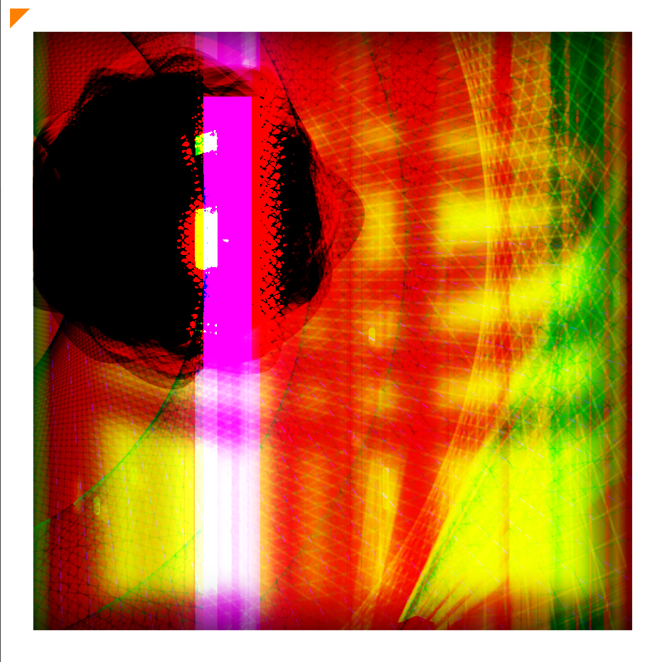
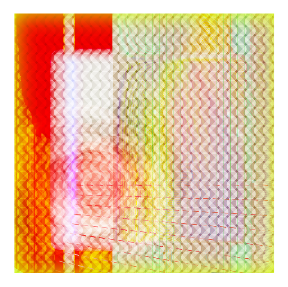
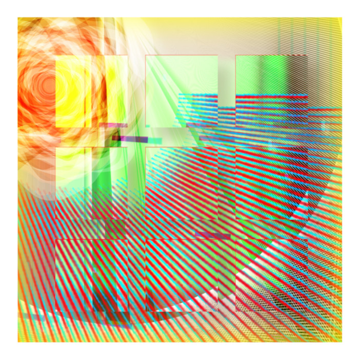
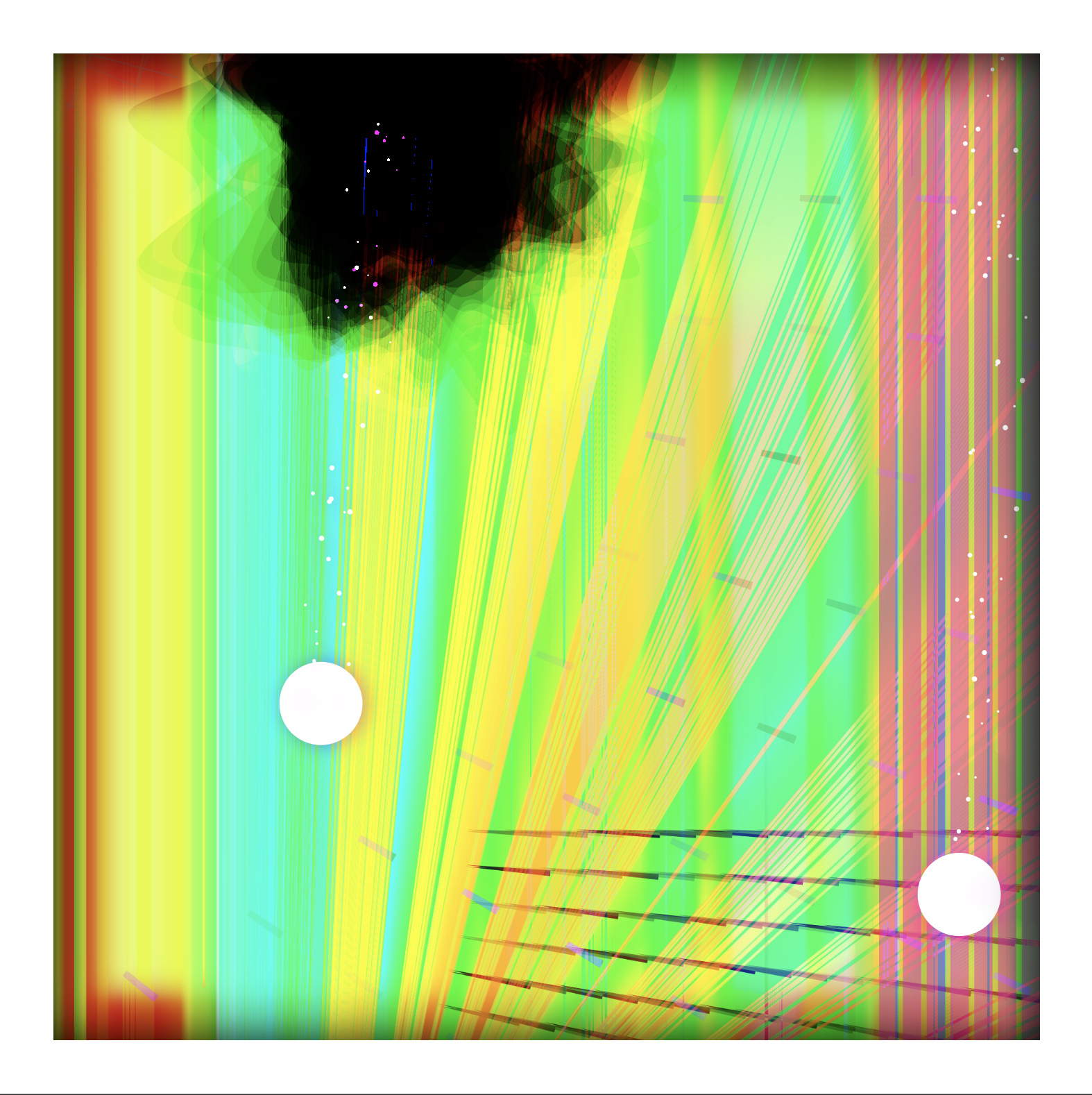
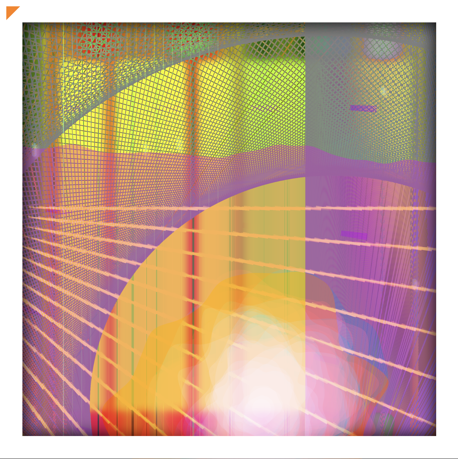
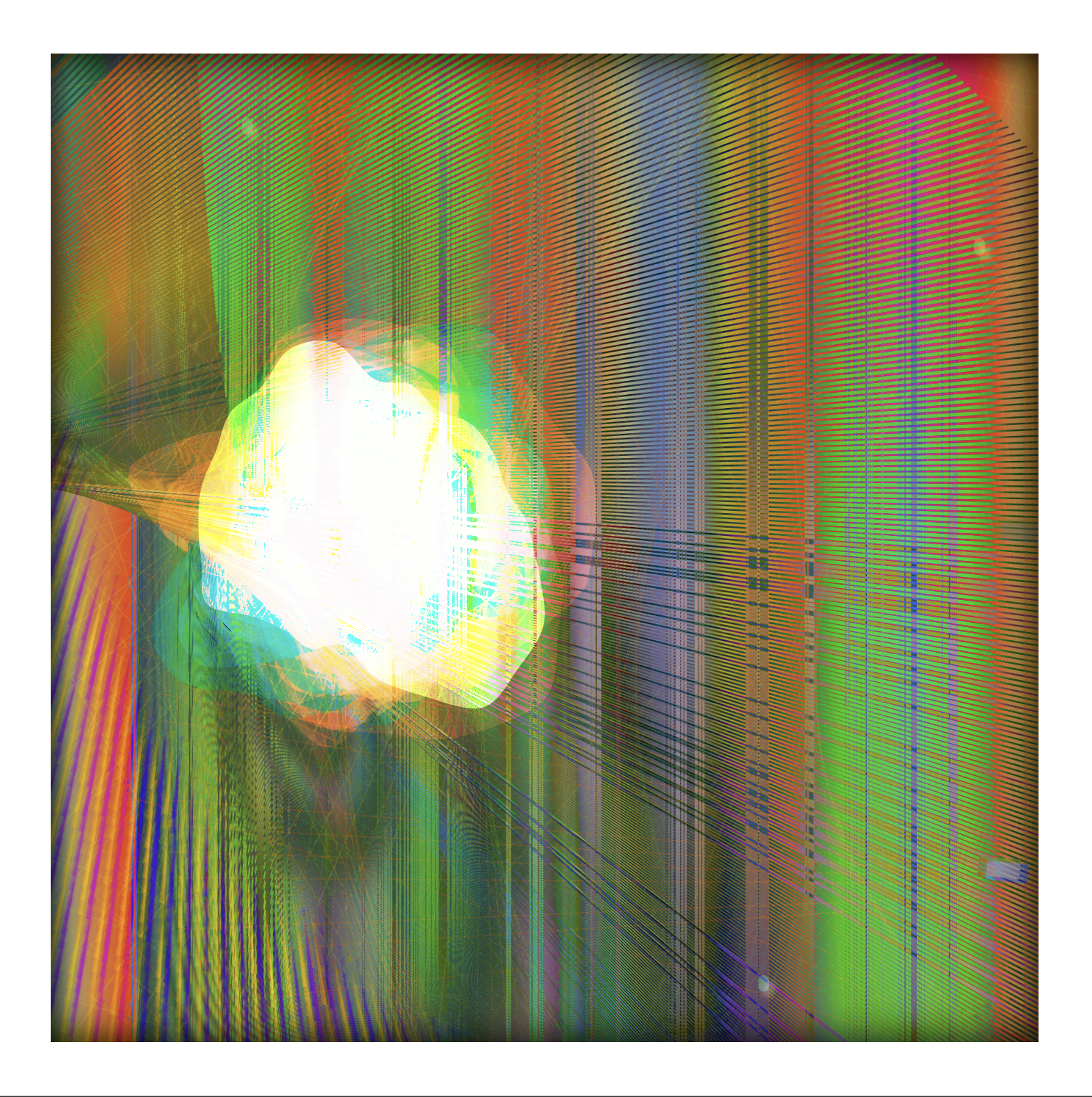
This long form, generative art collection by mindrash started as a high concept, Orwellian project capturing the theme of a twisted intertwined beauty in even terrible things. As the months progressed the visuals connected with my Memphis Meat Sweat experience and continued to what is has become today.
There is a twisted beauty in the pieces with a mild hallucinogenic feel. Visuals of labored breath movement, heartburn, and variations of sweat are interspersed with the memory of the delicious meal. You may have never had the meat sweats, but I am sure there are pointed times in your life that connect with this moment.
This collection explores the emotional experience of a good thing transforming into something undesirable. This transition generates a swirl of emotions, a blend of shock, disappointment, confusion, and despair. The experience of being engaged in a tug of war between the reminiscence of what once was and the reality of the present. It serves as a reminder of the transient nature of experiences and expectations, leading to introspection about the dynamics of good and bad in our lives.
Also ... I want to hear you say that you got The Meat Sweats In Memphis.
Fully Responsive 1:1 Generated With p5.js
This one is just straighforward onchain p5js. It is fully responsive in the display with a 1:1
ratio.
Here are the hot keys:
spec | value |
---|---|
Dimensions | Fully responsive 1:1 |
Image Type | S to download as a PNG. You can request a higher resolution. |
Blockchain | Arbitrum (Ethereum L2) |
License | CC BY-NC 4.0 |
Total Supply | 321 |
attribute | description |
---|---|
heartburn | BAD, REEEALBAD, OHLAWDY |
sweat | MILD, GETTINSERIOUS, DRENCHED |
breath | true or false |
mac and chee | true or false |
kitchen sink | true or false |
alkaseltzer hour | 17:00, 18:00, 19:00, 20:00, 21:00, 22:00 |
pepto day | Sunday, Monday, Tuesday, Wednesday, Thursday, Friday, Saturday |
In a lot of my work I combine multiple outputs by layering and blending them together. This one is no
different.
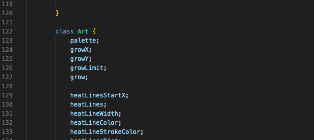
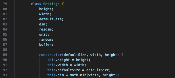
The first step in the process creates a backdrop. There are two major classes, Settings and Art, that
handle
the majority of the work.
The backdrop first creates a skeleton structure with primitive shapes that will show through as more and more pieces are layered together.
A few iterations of a method named makeObscene then takes over and does a bunch of the craziness with gradient lines and
twisting on angles.
This backdrop is then copied into a buffer that will be used on the primary canvas.
Next the animations of the heartburn and sweat are invoked over the backdrop as it pulses around for the
breath effect.
Finally, it is all framed up. I've been using the orange triangle in my work for a while and no one has ever asked about it. I had a coworker that used to put in typos and incorrect information towards the end of documentation just to see if anyone read that far. It used to drive me crazy. No one cares about this little game, but here I am at the end of this wondering if anyone will ever get this far. I use the orange triangle because ... ask me and I will tell you. Then I might stop using it once someone asks.